Another week of will he or wont he invade the Ukraine.
Should the invasion take place we should see ST risk off trading followed by more strength in the ZAR.
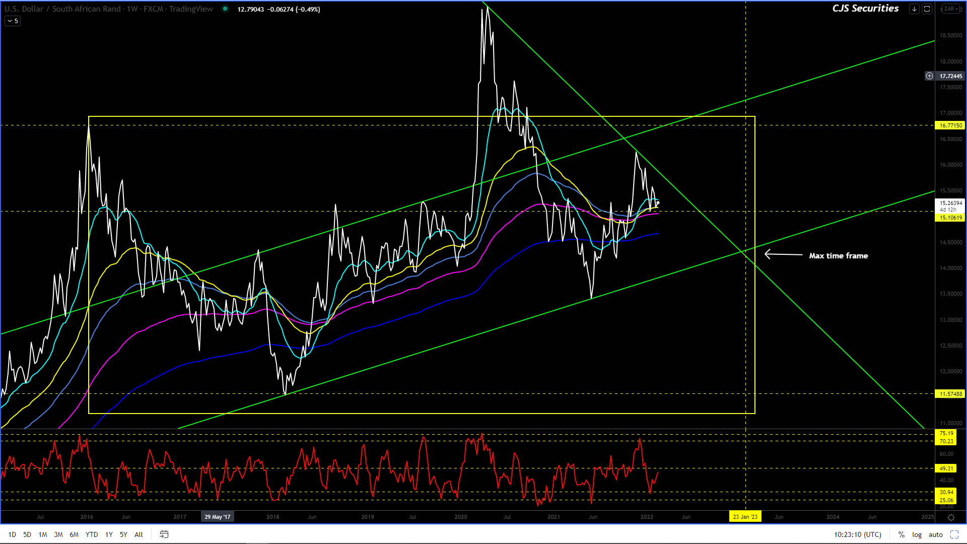
The below commentary remains well and truly intact for now.
What I see is R11.50 over the next 17 months.
I am convinced that the ZAR is in a multi-year corrective phase vs. the USD and that from today on, all upward spikes on this chart are well worth a short!
This chart could easily have a leg higher and trade toward the R16.77 level in the coming weeks.
This could be attributed to Russia invading the Ukraine or China invading Taiwan or Iran attacking Israel or all three, which should provide a risk – off environment, causing a quick and painful weakening of the ZAR.
An event of this nature should be seen for exactly what it is, an opportunity to sell the USD and buy the ZAR.
Until then, the range is likely to be R14.88 – R15.50 and I would seriously consider owning the bottom of the range!
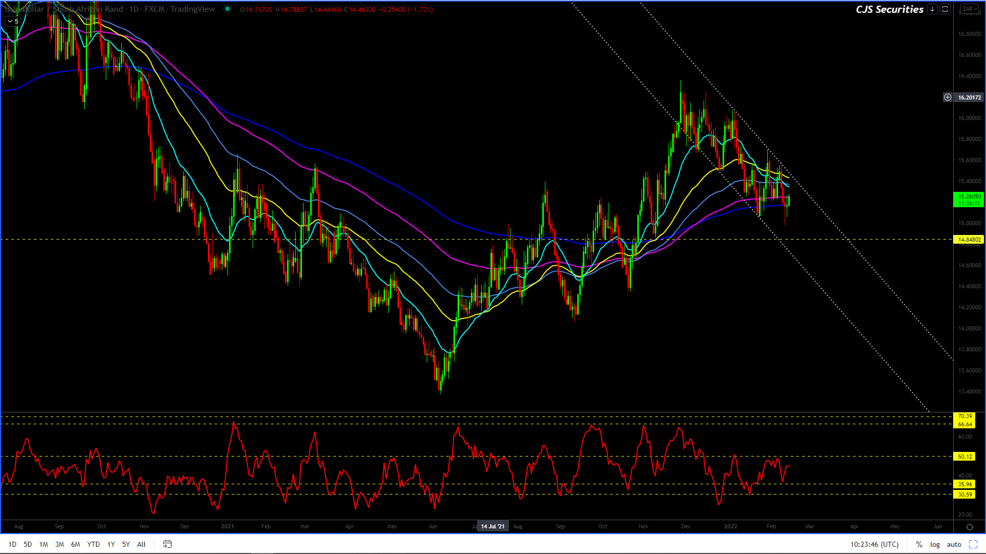
Dollar/Rand Daily Candle
Based on the charts current formation, we would only look to get long sub R15.05 scale down to the R14.80 level.
The daily chart fits into my weekly view.
I want a last leg higher into the R16’s to complete the chart.(but what I want does not count)
I cannot stress enough how important patience is and keeping your mind clear as emotions are sure to get the better of many this year.
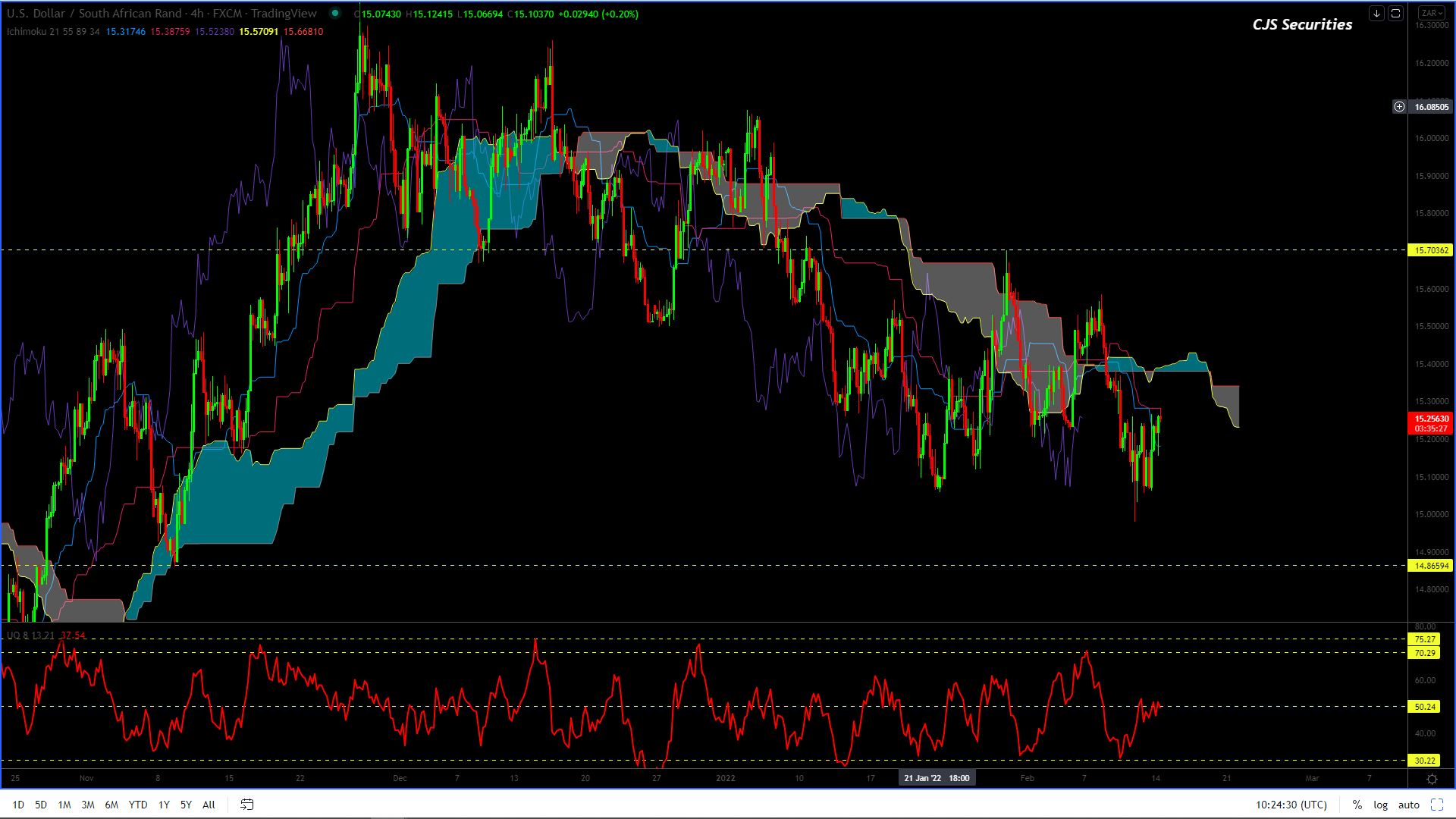
Dollar/Rand 240 min Candle
There is nothing to
say that will change the below outlook.
This chart is middle
of the range but can surprise with a last leg lower before looking to trade
higher.
And it’s with this in
mind that I am happy to hang back another week and let the chart play
out.
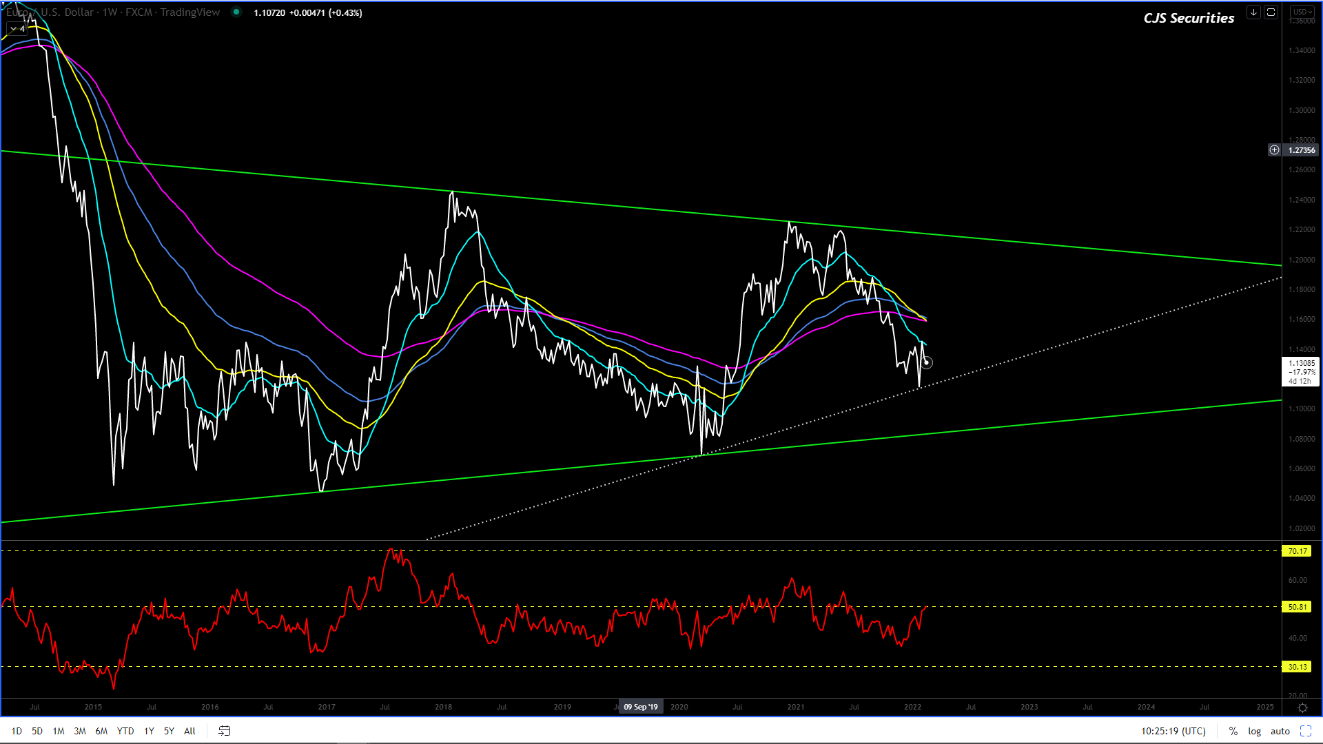
Euro/USD Weekly Close
#No Change in commentary
This chart remains well within the triangle range, while $1.1250 remains MASSIVE support.
In the ST, should we see this chart move back over $1.450 – $1.16!– This is currently underway.
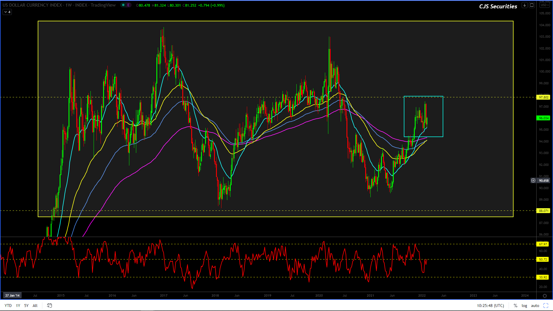
US Dollar Index Weekly Candle
#No Change in commentary
I am changing my view until further notice, and I think we are headed back to the 88.00 level over the next few months.
The chart’s upside momentum has failed. IMO
SA Government Bond 30 Year Yield Daily Close
The chart has now made a very solid base around the 10.30% level.
The chart remains range-bound, and all I can add is that the top of the range (11.40%ish) will be a fantastic buy as the more significant formation is starting to appear more and more like a consolidation for a severe leg lower.